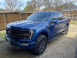
I couldn't decide on the orange with the black trim or black with the orange trim so I just ordered a set up both. Should make deciding way easier lol.
I couldn't decide on the orange with the black trim or black with the orange trim so I just ordered a set up both. Should make deciding way easier lol.
Great idea!
My opinion: on the iconic silver the, orange with black outline is the way to go. But you really can’t tell until you have it up against the truck. For such a statement tailgate sticker the aesthetics have to be right.
I’m in the same boat and might follow your lead and order both. I am leaning towards black with orange outlines on my stone gray but don’t want to get this wrong.
Honestly, we could probably get them close with powdercoating, but the longevity just wouldn't be there for us to take in on. To get something that would last long enough it'd probably have to be annodized (which we're not really equipped to do).
My black Tremor is on order. I was thinking that having the center section of the hood between the vents done in a matte finish would look good. Perhaps a using the Stealth PPF. I do like the black with orange outline F-150 decal for the back.
I couldn't decide on the orange with the black trim or black with the orange trim so I just ordered a set up both. Should make deciding way easier lol.
Great idea!
My opinion: on the iconic silver the, orange with black outline is the way to go. But you really can’t tell until you have it up against the truck. For such a statement tailgate sticker the aesthetics have to be right.
I’m in the same boat and might follow your lead and order both. I am leaning towards black with orange outlines on my stone gray but don’t want to get this wrong.
Honestly, we could probably get them close with powdercoating, but the longevity just wouldn't be there for us to take in on. To get something that would last long enough it'd probably have to be annodized (which we're not really equipped to do).
Ask, and you shall receive! Our first community suggested decal is now LIVE! Offered in gloss and matte black for a unique appearance compared to the copper factory decal. Size is a 99% match to the factory decal, and installation is a breeze with our provided template. We've got a couple ideas in the works for hood decals & fender vent decals coming soon so be on the lookout for those! Massive thank you again to everyone who has shown support and enjoyed what we've put out so far, we're extremely grateful to serve this wonderful community! (Also the template only works if you have a Tremor already to hopefully mitigate people from up-badging)
.
Compliment an ultimate Ford F150 Tremor build with this blackout bedside decal. Manufactured using automotive wrap film for easier installation and maximum l...
Honestly, no clue. I wish I could offer more advice but we've never done it so the process is probably miles different than print, or paint color matching
@VIPAutoAccessories any update on the orange color code you used for the updated decals? We all want to paint different accessories (lug nuts, calipers, etc) and we're going nuts trying to get the right color.
Looking good! Some people have still asked for the bedside decal color match so it's all really down to preference. Since we're now matching the badges and grill we've opted to go with a gloss sheen instead of matte (since the bedside decal is really the only matte-like orange on the truck). We're really happy with how the new color turned out, and hopefully we can get some photos from members, and our in-house photos soon!
Gloss. The previous version which has been discontinued was in matte. Unfortunately with a matte over laminate, it is nearly impossible to match the electric spice on the Tremor.
@VIPAutoAccessories any update on the orange color code you used for the updated decals? We all want to paint different accessories (lug nuts, calipers, etc) and we're going nuts trying to get the right color.
So, this is going to be pretty complicated to explain but I'll try my best! So after talking to our paint guys, the methodology we used to color match has zero correlation to color matching for paint or powder coat. The only benefit it would offer is to see a swatch (which really doesn't do much when it comes to paint or powdercoat mixes). So with printing graphics there's a mix of CMYK (cyan, magenta, yellow, and black) which are the ink colors used to mix and make a specific color. The range for each color ranges from 0-100% so like 50% K and 100% M would give you a darkened magenta. Anyway, we took a print color swatch book (which doesn't give us CMYK values, just has the raw color swatch which we then have to play with the CMYK to try and match the swatch). Now here's where the annoying part comes in; there are different manufacturers of pantone color swatch books, all which use their own taxonomy. So if I say pantone 123, pantone 123 (lets say its a red) ONLY works if you're referencing the same swatch book as we have. Some other swatch maker might have pantone 123 be a violet.
*Deep Breath* so, basically, we have identified a color based on the pantone swatch book we use internally for our printed decals that is a close match to the tremor orange. Ultimately sharing it has zero value to anyone outside of someone in the print industry since the color matching process is entirely different, and not standardized at all like auto paint. TLDR; It's complicated and our color code only works for people in the print industry, and even then, only if they have the same color swatch book to reference as we use.
But we won't leave you empty handed; The color match we found, has a swatch ~somewhat similar~ to pantone 144 on the website below. It's not the exact same by any means, and the color will vary depending on the device you're viewing on since its not super likely anyone is viewing on a color-corrected monitor at any given moment. But this is really all we can share without anyone in particular having the same swatch book we use in hand to compare to their truck. I wish we could offer more help, but we haven't gone down a tremor paint match at all, just a printed color match (which unfortunately translates zero to paint)
ANOTHER TLDR; The print code we have doesn't work for paint at all. Looks somewhat similar to pantone 144 at the link below, but without having the exact same swatch book we have in hand, the code doesn't even do anything since it isn't even the CMYK print ratios.
.
This site displays a review of standard colors according the Pantone Colour Matching System. It is used in a variety of industries, primarily printing, though sometimes in the manufacture of coloured paint, fabric and plastics.
Gloss. The previous version which has been discontinued was in matte. Unfortunately with a matte over laminate, it is nearly impossible to match the electric spice on the Tremor.
Not to be particular but electric spice is substantially different than the active orange on the tremor. the dark block is electric spice, the yellow is my latest shot at a color match. Obviously print vs paint is a real thing, I'm learning.
Show off your 6th gen Ford Bronco Sasquatch package with these emblems. Made with injection-molded ABS plastic and designed to withstand the elements for man...
So, this is going to be pretty complicated to explain but I'll try my best! So after talking to our paint guys, the methodology we used to color match has zero correlation to color matching for paint or powder coat. The only benefit it would offer is to see a swatch (which really doesn't do much when it comes to paint or powdercoat mixes). So with printing graphics there's a mix of CMYK (cyan, magenta, yellow, and black) which are the ink colors used to mix and make a specific color. The range for each color ranges from 0-100% so like 50% K and 100% M would give you a darkened magenta. Anyway, we took a print color swatch book (which doesn't give us CMYK values, just has the raw color swatch which we then have to play with the CMYK to try and match the swatch). Now here's where the annoying part comes in; there are different manufacturers of pantone color swatch books, all which use their own taxonomy. So if I say pantone 123, pantone 123 (lets say its a red) ONLY works if you're referencing the same swatch book as we have. Some other swatch maker might have pantone 123 be a violet.
*Deep Breath* so, basically, we have identified a color based on the pantone swatch book we use internally for our printed decals that is a close match to the tremor orange. Ultimately sharing it has zero value to anyone outside of someone in the print industry since the color matching process is entirely different, and not standardized at all like auto paint. TLDR; It's complicated and our color code only works for people in the print industry, and even then, only if they have the same color swatch book to reference as we use.
But we won't leave you empty handed; The color match we found, has a swatch ~somewhat similar~ to pantone 144 on the website below. It's not the exact same by any means, and the color will vary depending on the device you're viewing on since its not super likely anyone is viewing on a color-corrected monitor at any given moment. But this is really all we can share without anyone in particular having the same swatch book we use in hand to compare to their truck. I wish we could offer more help, but we haven't gone down a tremor paint match at all, just a printed color match (which unfortunately translates zero to paint)
ANOTHER TLDR; The print code we have doesn't work for paint at all. Looks somewhat similar to pantone 144 at the link below, but without having the exact same swatch book we have in hand, the code doesn't even do anything since it isn't even the CMYK print ratios.
.
This site displays a review of standard colors according the Pantone Colour Matching System. It is used in a variety of industries, primarily printing, though sometimes in the manufacture of coloured paint, fabric and plastics.
Not to be particular but electric spice is substantially different than the active orange on the tremor. the dark block is electric spice, the yellow is my latest shot at a color match. Obviously print vs paint is a real thing, I'm learning. View attachment 1789
Good call, I've just heard the paint code called electric spice, active orange, tremor orange, and like 3 other names. It's all pretty confusing at this point if we're being honest! Doesn't help that the interior stitching, dash accents, and seat piping are all similar colors yet distinct. I think someone called it uncertain orange or something to that effect, which is pretty spot on from what we've seen (since Ford went wild with the color variance on these).
Show off your 6th gen Ford Bronco Sasquatch package with these emblems. Made with injection-molded ABS plastic and designed to withstand the elements for man...